Chandan Mahimkar goes on a different ‘type’ of holiday.
Text and images by Chandan Mahimkar
We live in a world full of beautiful letterforms. They play a major role in our lives as readers, travellers, art lovers, professionals, consumers, foodies, no matter what our inclination or location. It may escape our notice but from road signs to shop fronts and menu cards to monuments, travel involves a subtle but constant interface with typography.
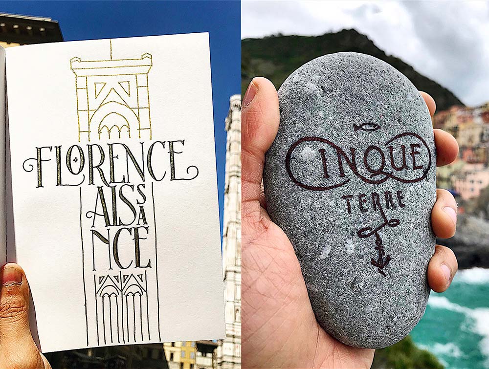
Interestingly, typefaces have barely changed over centuries; their shapes and styling have remained almost the same. I was drawn towards typography very early in my life. Then, while pursuing design and advertising at Mumbai’s Sir JJ Institute of Applied Art, I actually learnt the art of Typography and Lettering as a discipline, although mostly proactively through observation, lots of practice and reference books. Unfortunately, we never learnt about the history of type and its origins in art school but the roots of Western design and type are so entrenched in European art history that I am always in search of inspiration in the cities of Europe. It has become a ritual for me to create a lettering piece inspired by the city or region that I’ve visited.
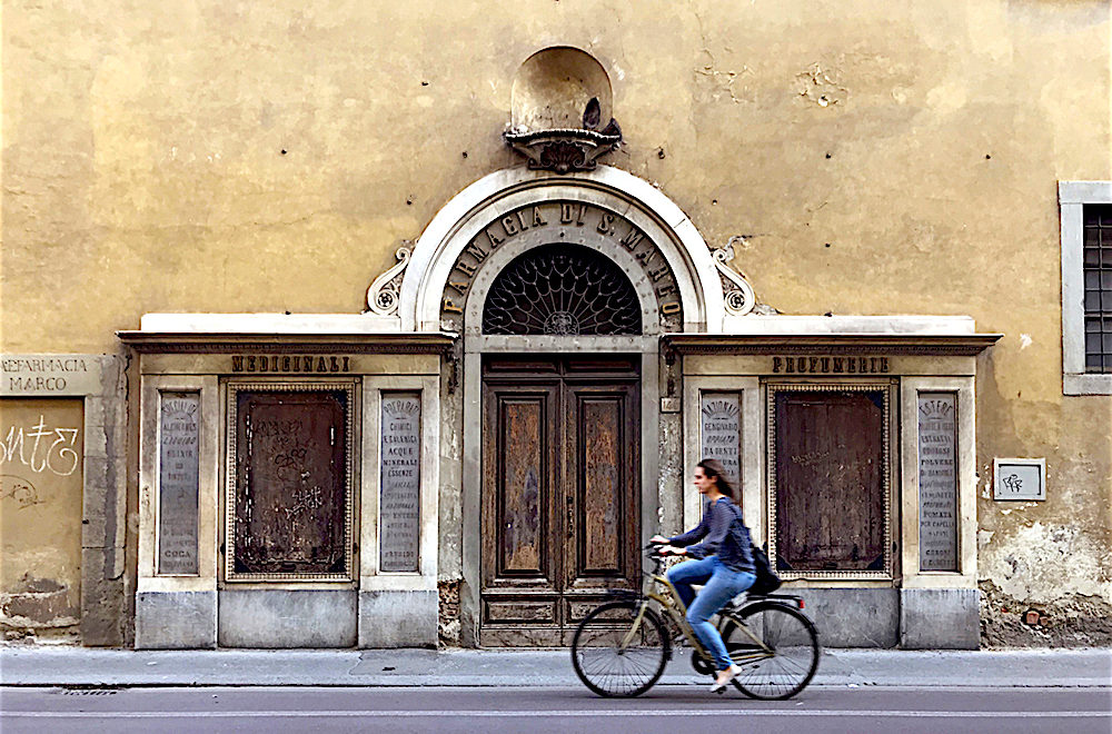
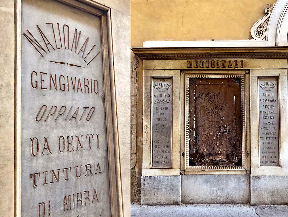
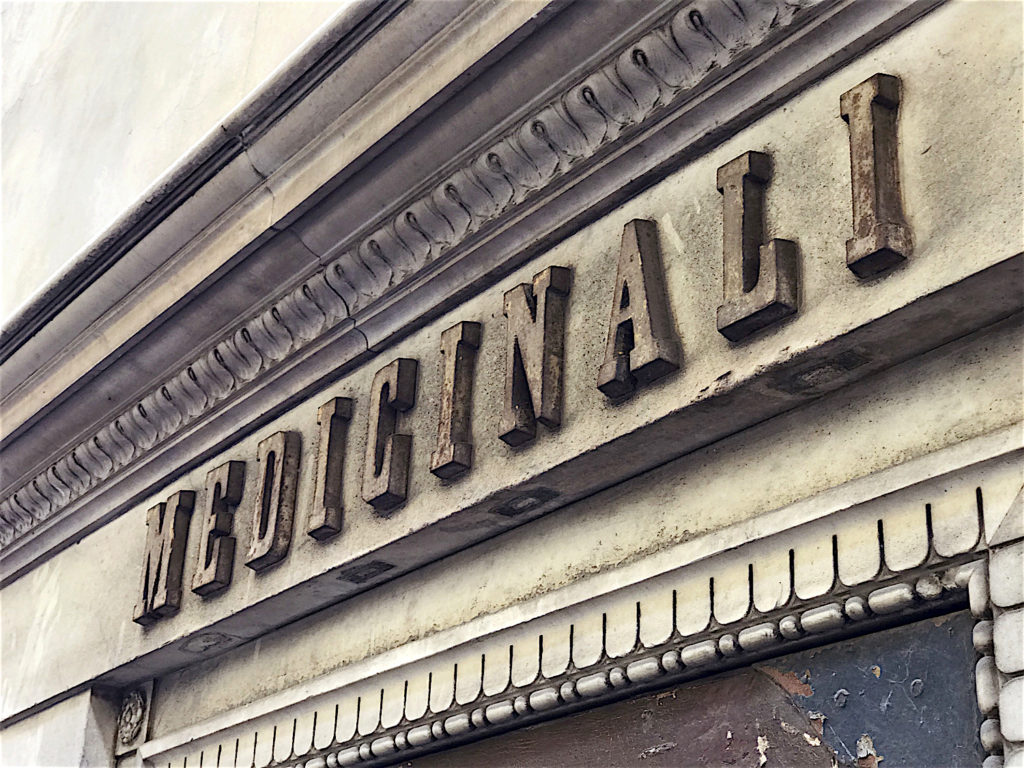
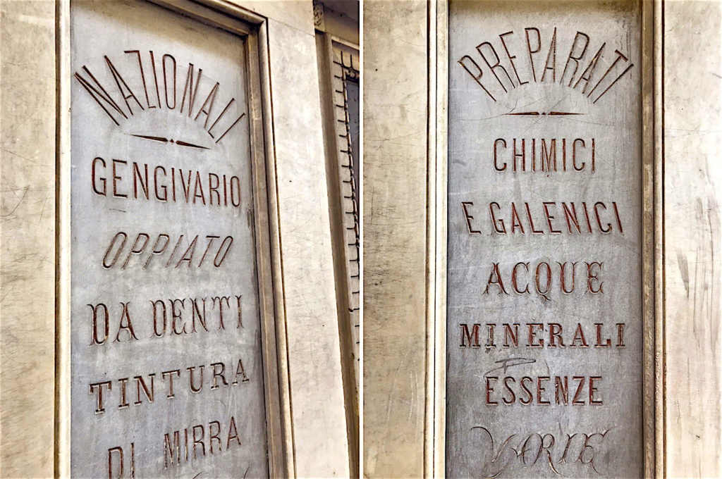
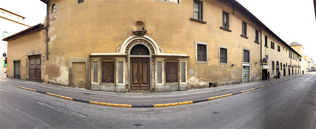
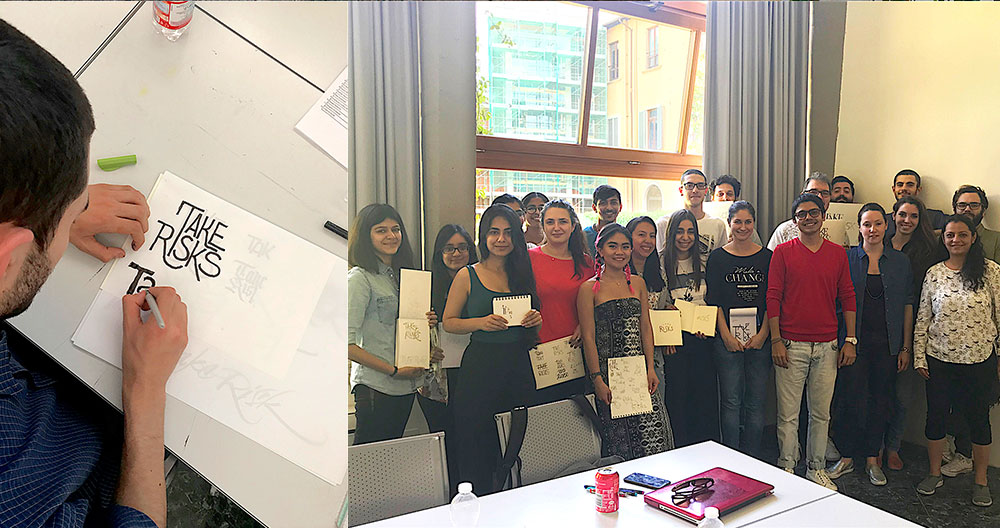
Recently, I was invited by IED Firenze, a premier design school in Florence, to give a talk on design and to conduct a lettering workshop for post-graduate students of graphic design and typography. It was a memorable experience to teach what I love in this city of art. Before I left for my trip, Brooke Robinson, founder and curator of @Goodtype account on Instagram, introduced me to Paula Del Mas, a graphic designer and typographer based in Florence. Paula led me to a fantastic but overlooked piece of Florentine history – the Farmacia di San Marco at 59 Via Camillo Cavour. This historic building was a pharmacy established by the Dominican friars and opened to the public in 1450. While its typography-rich exterior is a lettering enthusiast’s delight, the building has been closed since 1995, keeping its well-preserved interiors out of reach of visitors.
In Italy, it was only natural to be hooked on to the Renaissance period; I soaked in its art, culture and history by walking around the giant art classroom called Florence and later, in the historic seaside villages of Cinque Terre along the Italian Riviera. While I did visit the Uffizi and the Duomo in Florence, what I sought was a serious dose of ‘type’ from that era. And each day the city would surprise me with its gems – from shop signages to public signs, writings on cathedral walls and floors and, of course, the front of that historic pharmacy.
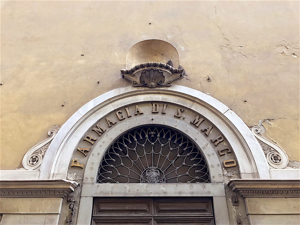
Farmacia di San Marco, Florence
This 15th century pharmacy, established by the Dominican friars (known for their medicinal preparations) under the auspices of Cosimo de Medici, is a design lover’s delight. Its exterior displays the brilliant use of many lettering styles to create an extraordinary balance of words. The façade layout is reminiscent of a contemporary luxury store. Now closed and abandoned, this neglected Florentine institution had its last round of restoration in the late 19th century. I hope that the pharmacy opens to the public and that local residents get to interact with their history again.
Cathedral Santa Maria del Fiore, Florence
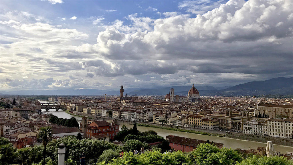
The Cathedral Santa Maria del Fiore or the Florence cathedral was built between 1296 and 1436, and shows the usage of pure Roman letters. One can see the initials of the Opera del Duomo (founded in 1296 as the Cathedral workshop) at certain places. Also known as OPA, it is responsible for the conservation of this monument along with a few others. The cathedral is part of a larger cathedral complex that is a UNESCO World Heritage site.
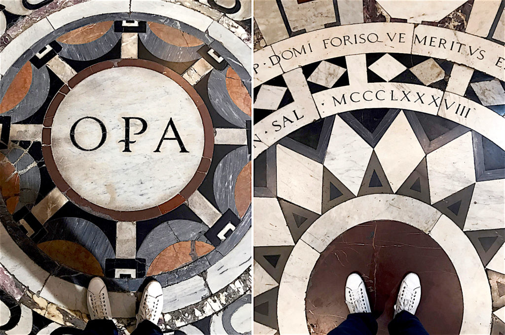
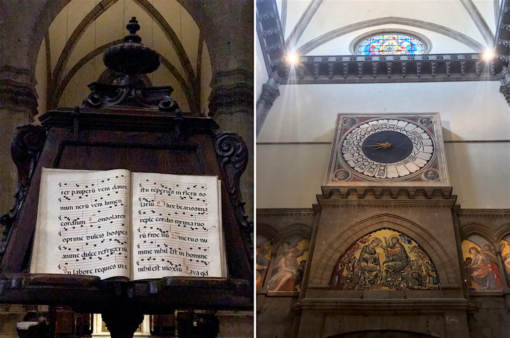
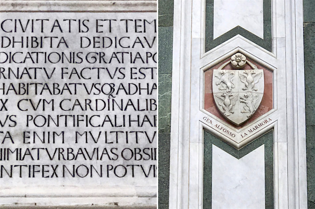
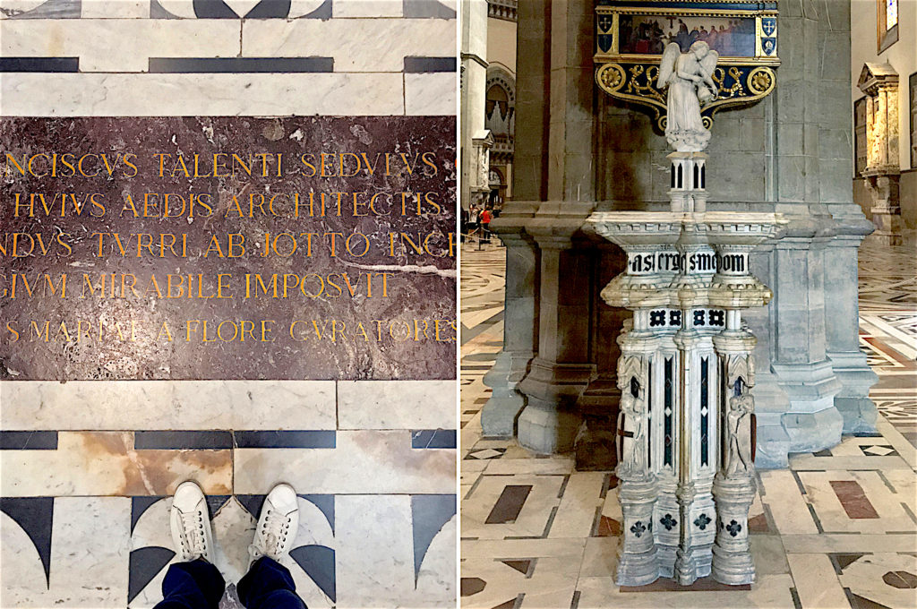
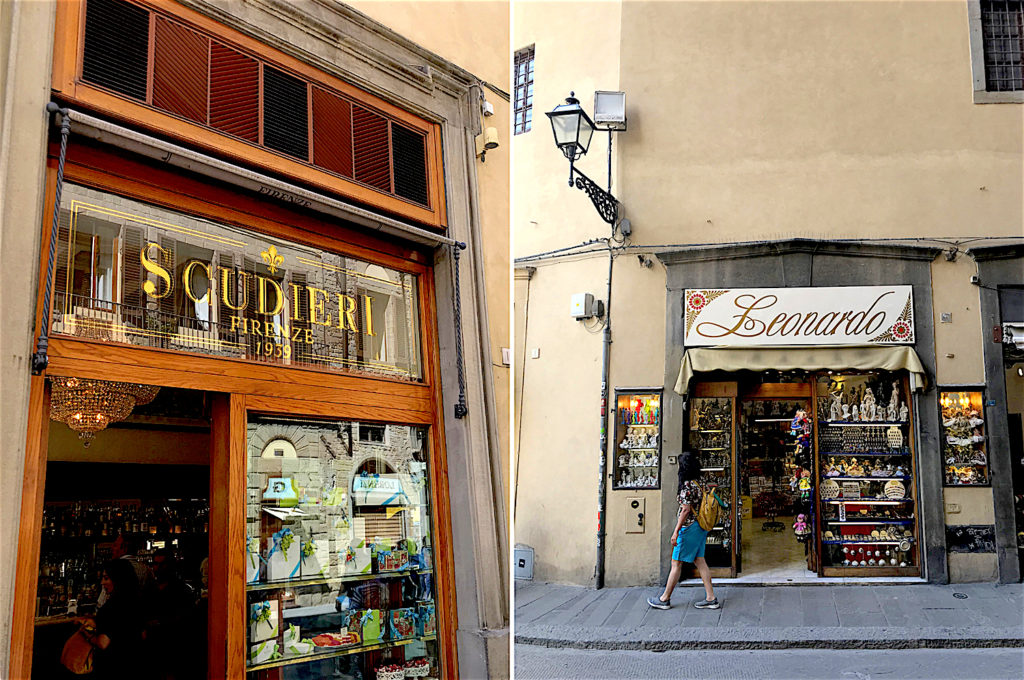
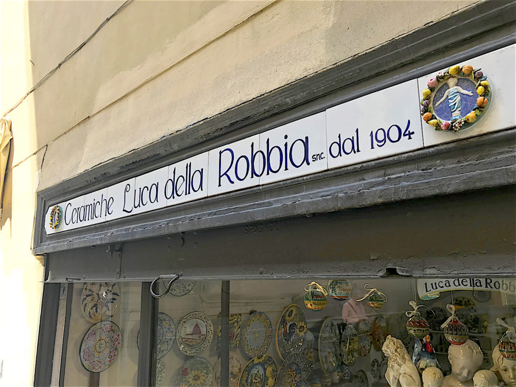
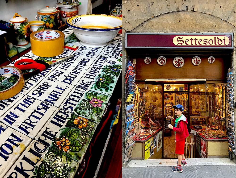
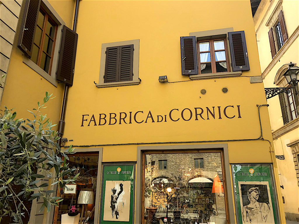
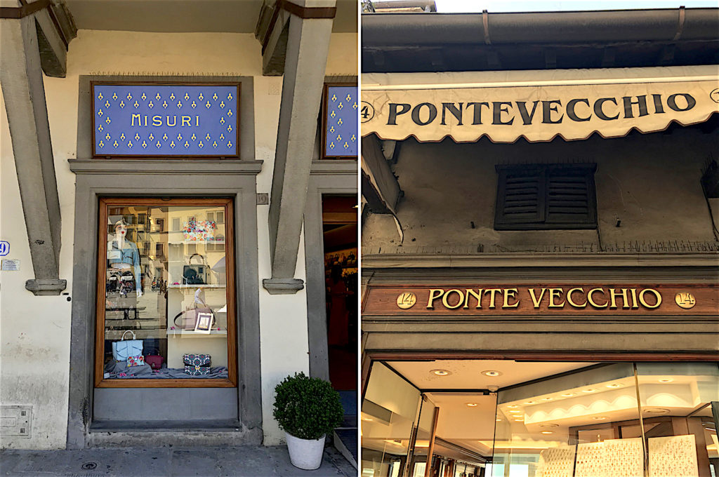
Shop Signs, Florence
The age old design sense and typographic influence is omnipresent in Florence. Each of these shops and buildings take great pride in their historic past, celebrating the Florentine design sense in their own way.
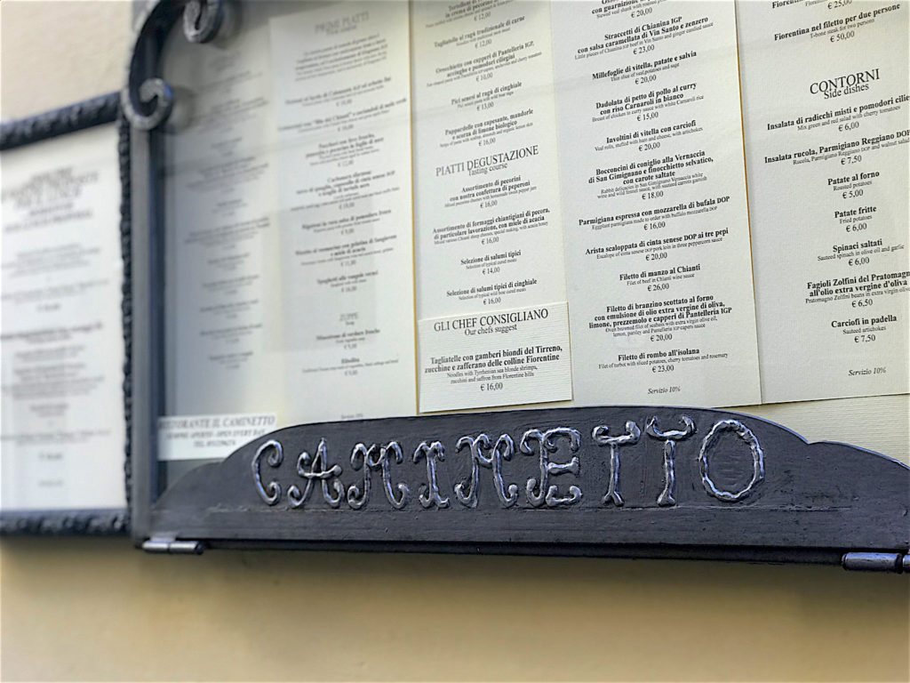
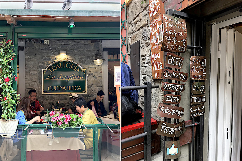
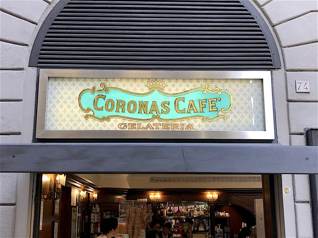
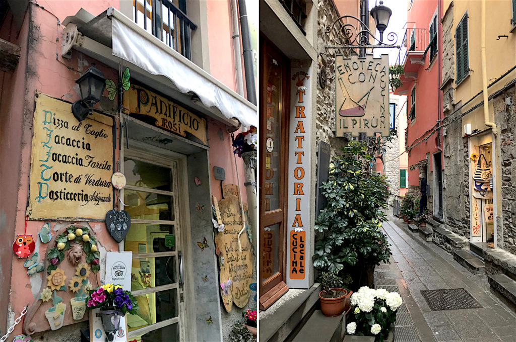
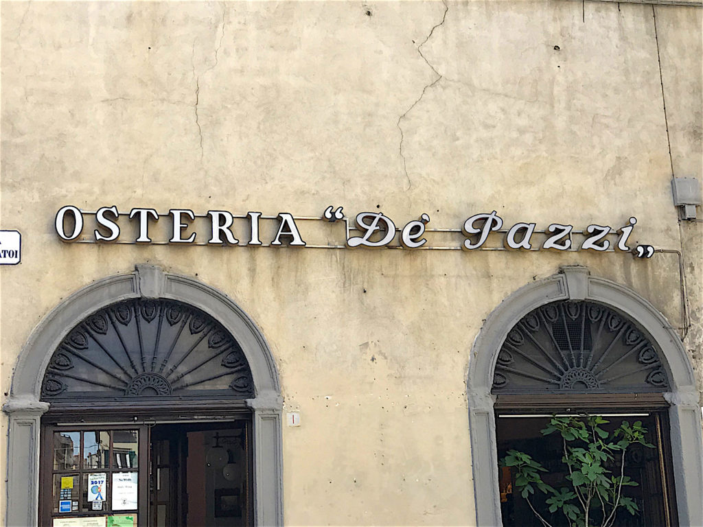
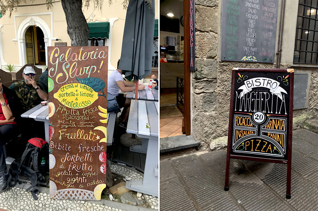
Restaurant Signs, Florence and Cinque Terre
Both traditional and contemporary type design may be seen in these cafes and restaurants in Florence and Cinque Terre. The older restaurants tend to stick to traditional lettering.
Class at IED Firenze
My lettering workshop in progress at IED Firenze.
 |
Chandan Mahimkar is a designer, creative director, lettering artist and traveller. He shares his travel photography and his unique hand lettered journal of travel experiences @see_mahimkar on Instagram. His travel photography is shared by some of the top travel accounts on Instagram like @passionpassport, @iamsterdam and @projectvanlife to name a few. |


Thank you Chandan for this awesome sharing of your amazing pictures ans experiences. seeing the world through your eyes!!!! would love to attend your class in Mumbai.
Wonderful, inspiring, simply loved it.
Very informative Chandan!!!
I finally managed to read this piece thru… Glad I did..
Wow! Really enjoyed this experience that you have shared. Thanks for the same. feel a lot more enriched.